
Start with the product and the customer path
Before choosing fittings, look at what must be seen first. A clothing rail needs even vertical light, while jewellery, cosmetics and premium food displays need tighter accent light with stronger contrast. In a shopfront, the customer usually reads the window first, then the entrance, then the main display tables and wall bays. If that sequence is unclear, the space feels busy and stock can get lost.
Walk the floor at opening time and again after dark. Check where daylight falls, where shadow patches appear, and which shelves sit too close to reflective glass or polished surfaces. In coastal towns like Durban and Umhlanga, humidity can also affect finish selection and maintenance, so the lighting plan should allow for fittings that are easy to clean and access.
- List the top 10 products you need seen first.
- Mark the customer route from the entrance to the till.
- Note glare points on mirrors, glass doors and glossy packaging.
- Check which areas need brighter task light and which need softer background light.
Use layers rather than one flat level of light
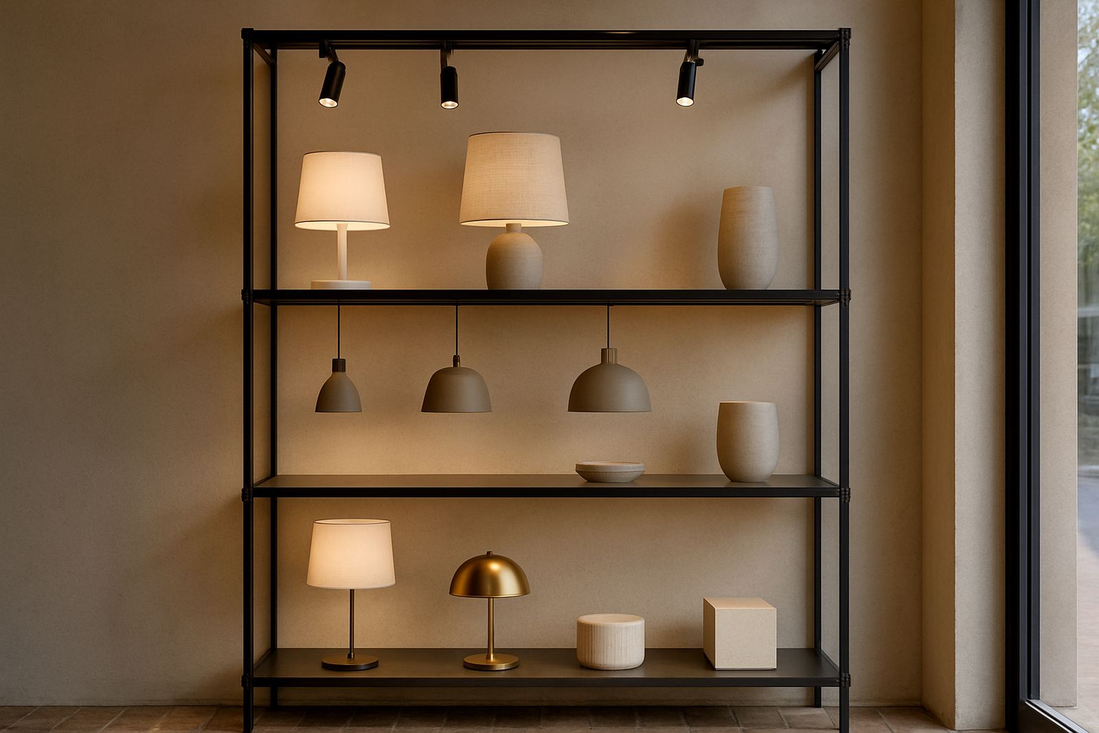
Good retail display lighting usually has three layers. Ambient light sets the base level so the shop feels comfortable. Accent light brings attention to key displays. Shelf light adds detail where smaller products sit in rows. When every fitting is aimed the same way, the room can look flat and the eye has nowhere to rest.
For shopfronts, think in zones. The window should be brighter than the street enough to hold attention, while the back wall can stay slightly lower so the eye moves through the store. Restaurants that sell products near the till or at the bar can use the same approach, with warmer light for food and decorative items. Home retail corners, such as curated homeware displays, also benefit from layered light rather than one ceiling wash.
In South African premises with load-shedding planning, keep key displays on circuits that can be backed up where needed. That helps the front of house stay readable during outages and avoids a dead-looking shop when only partial power is available.
Set the right brightness for shelves and feature bays
Too little light makes stock look dull. Too much light can wash out colour, create reflections and tire the eye. The aim is to match brightness to product type and shelf depth. Deep shelving usually needs light from the front and above, while shallow wall bays can work well with a narrower beam. Keep the brightest point on the product, not on the shelf edge or the fascia.
For practical planning, test the display from a standing customer height and from a seated viewing angle where needed. If the label is hard to read at 1.5 metres, the light plan needs adjusting. In a busy retail setting, the person walking past should catch the product shape in less than a second, then see the detail on the second glance. Thats usually the sign the lighting balance is right.
- Check readability of price tickets at 1 to 1.5 metres.
- Look for dark bands on lower shelves.
- Reduce glare on shiny packaging by adjusting beam direction.
- Keep repeated shelf bays consistent so the display feels ordered.
Choose fixture positions that do not fight the shelving
Fixture position matters as much as fixture type. If downlights sit directly above the aisle but not the bay face, the shelves can stay in shadow. If tracks are too close to the wall, beams can clip the top shelf only. A better result usually comes from placing fittings to wash the front of the display while leaving room for stock changes and cleaning.
For gondolas, end caps and island displays, aim for coverage that pulls the eye from side to side. In shopfront glazing, avoid placing fittings where they create double reflections at night. In older buildings around Rosebank, Pretoria or central Johannesburg, ceiling heights and structural beams can affect spacing, so a proper site lighting audit saves time later.
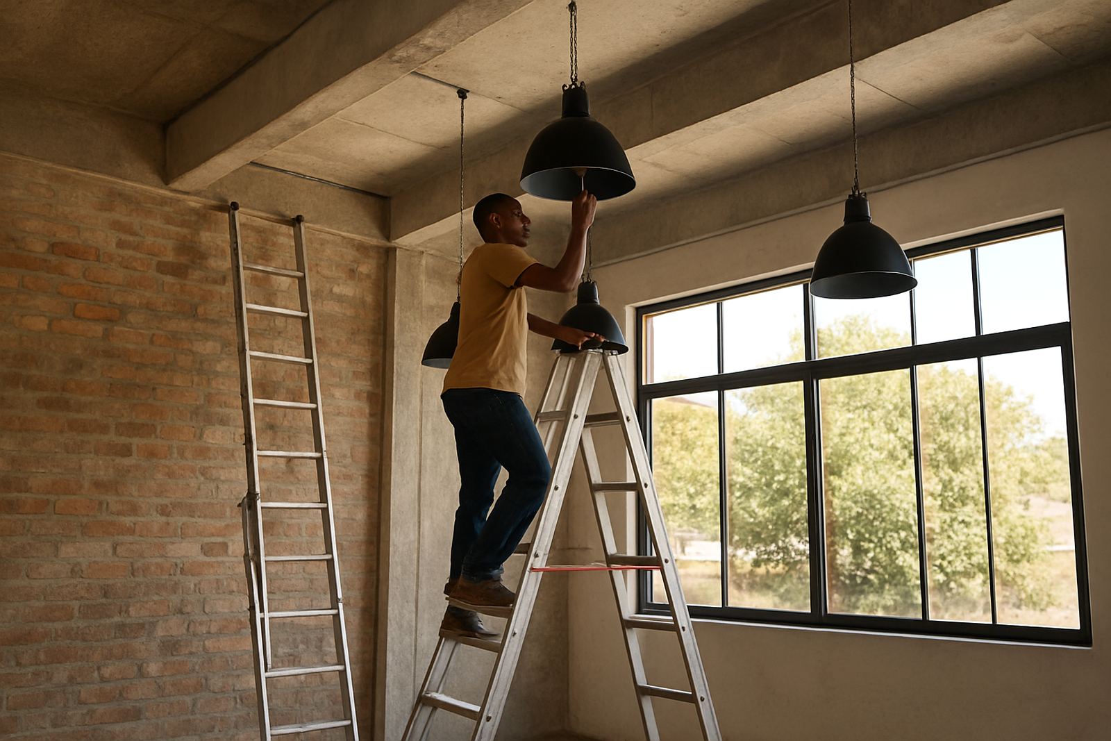
Also allow for maintenance. If a ladder is needed every time a lamp fails, the system becomes expensive to run. In retail work, practical access matters just as much as the look.
Match colour temperature and colour rendering to the stock
Colour changes under poor light. Whites can look grey, reds can look muddy, and skin tones can look flat. For display lighting, the colour temperature should suit the product and the mood of the store. Warmer light is often better for fashion, hospitality and homeware, while a cleaner neutral tone can work well for technical goods, cosmetics and food packaging. The key is consistency across the same display zone.
Colour rendering is equally important. If a product looks different in the shop from how it appears in daylight, returns and hesitation increase. This is especially important for boutiques, tile displays, decor stores and premium gifting counters. A sample board or mockup helps confirm the result before installation, particularly when multiple materials sit side by side.
For stores that trade late into the evening, remember that exterior spill light can affect how the display reads from outside. The window should still look inviting after dark without turning the glass into a mirror.
Build a simple checklist for installation and handover
A clean handover prevents small problems from becoming daily annoyances. When the system is installed, each display area should be checked in daylight and after dark. Focus on beam aiming, dimming levels, clean trims, and whether labels remain readable from the main circulation route. If the store uses control zones, test them during a normal trading rhythm, not only in an empty room.
For multi-branch retailers, the same standards can be repeated across Johannesburg, Cape Town, Durban and Umhlanga without making every store feel identical. The aim is consistency in quality, not a one-size-fits-all look. That is where proper fixture specification and post-install focusing make a real difference.
- Confirm all feature bays are lit evenly from opening to closing time.
- Test dimmers, switches and any timed control settings.
- Check for shadows from signage, gondolas and hanging stock.
- Clean lenses and trims before final sign-off.
- Record settings for future maintenance and seasonal changes.
When to bring in a lighting designer
If your displays look fine in daylight but weak at night, or if the same shelf keeps drawing complaints, it is time to step back and review the full lighting plan. A specialist can assess the site, specify fittings, prepare layout plans and coordinate installation so the result is easier to manage. This is especially useful for shopfronts with mixed uses, such as retail plus tasting areas, service counters or feature product walls.
Illumin8d works from Rosebank, Johannesburg and supports retail lighting projects across South Africa, including Sandton, Midrand, Pretoria, Cape Town, Durban and Umhlanga. The team led by Mandla Ndlovu can assist with concept design, site lighting audits, fixture specification, layout plans, control design, 3D visuals, mockups and installation coordination, all with the aim of making products easier to see and better presented.
For retailers, the right display light is not about making the space look busy. It is about helping customers notice the right products, read them quickly and feel confident enough to buy.