
Match the light to the space and purpose
Start with the main activity in each room. A shopfront needs enough brightness to draw attention at dusk and after load-shedding, but the colour temperature should still flatter products and signage. Restaurants need layers of light, with warmer tones for dining areas and slightly cooler task light in prep zones. Homes usually benefit from a softer overall tone, especially in lounges and bedrooms.
In humid coastal areas like Durban or Umhlanga, warmer light often feels more comfortable in living spaces because it softens reflective surfaces and helps a room feel less stark. In a Cape Town or Pretoria kitchen, a neutral white may suit stone tops, cabinetry and work surfaces better. The point is not to choose one temperature for every room, but to let function lead the decision.
- Shopfronts: 3000K to 4000K, depending on the brand look
- Restaurants: 2700K to 3000K for dining, 3500K for prep areas
- Homes: 2700K to 3000K for relaxation, 4000K for utility spaces
Use warmer light to calm, cooler light to clarify
Warmer light tends to slow the mood down. It suits reception spaces, bedrooms, lounges and intimate dining areas. It can also help wood, leather and warm paint colours look richer. Cooler light makes surfaces read cleaner and helps detail stand out. That is useful in kitchens, bathrooms, retail displays and work areas where accuracy matters.
A useful test is to ask what the room should feel like at 7pm on a winter evening, or at midday on a bright summer day. If the answer is calm and welcoming, go warmer. If the answer is clean, focused and efficient, go cooler. Most projects need a mix, not a single setting everywhere. For example, a home in Johannesburg might use 3000K in the lounge and 4000K in the scullery.
- Choose warmer light when comfort and atmosphere matter most
- Choose cooler light when visibility and detail matter most
- Use both in one project if the space has more than one function
Check the colour temperature against finishes and fittings
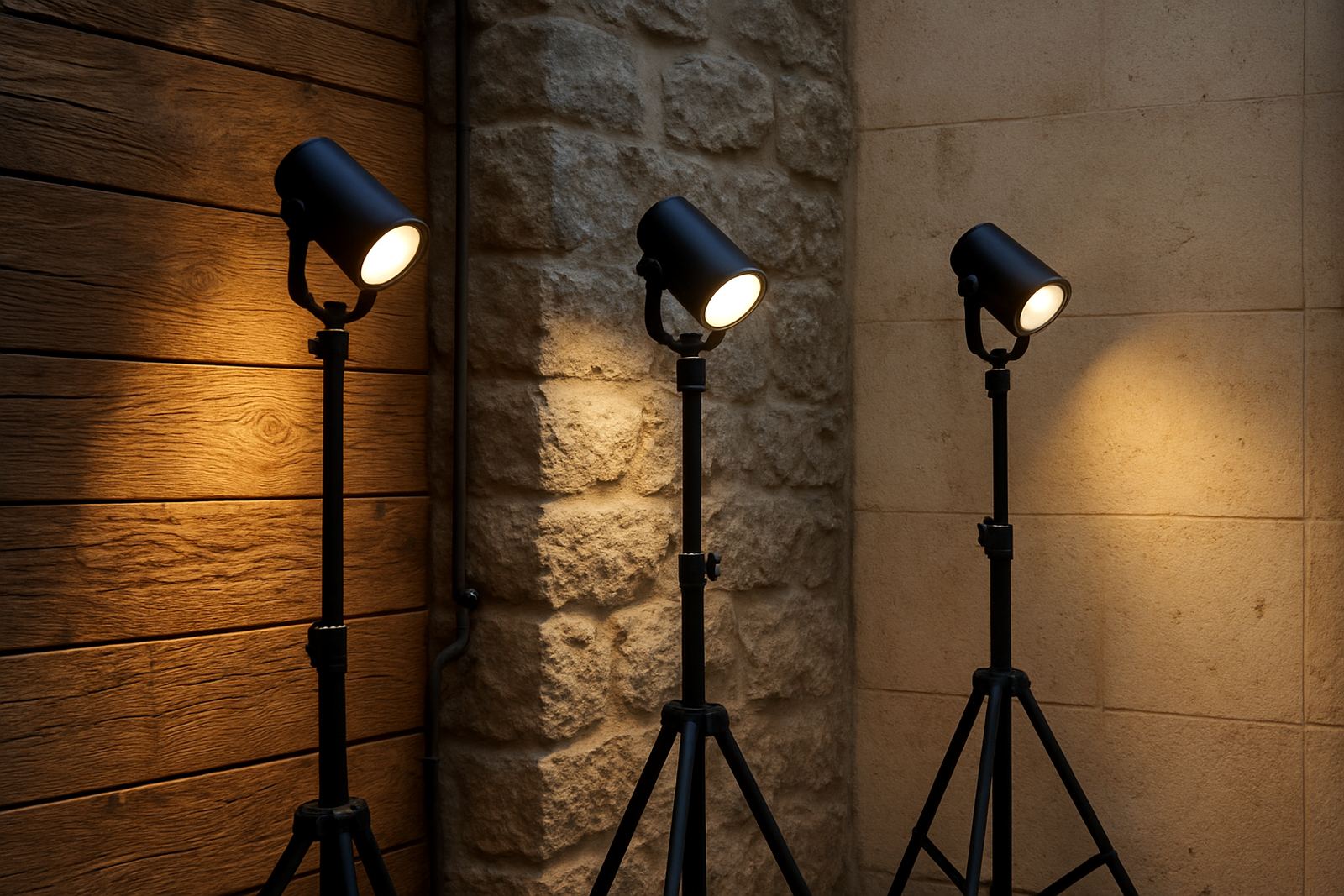
Paint colour, flooring, cabinetry and metal finishes all affect how light appears. A warm white wall can look cream under 3000K, but the same wall may look flat under a very cool source. Dark stone, timber and textured plaster usually benefit from warmer light. White tiles, chrome, glass and light coloured surfaces can handle cooler temperatures better.
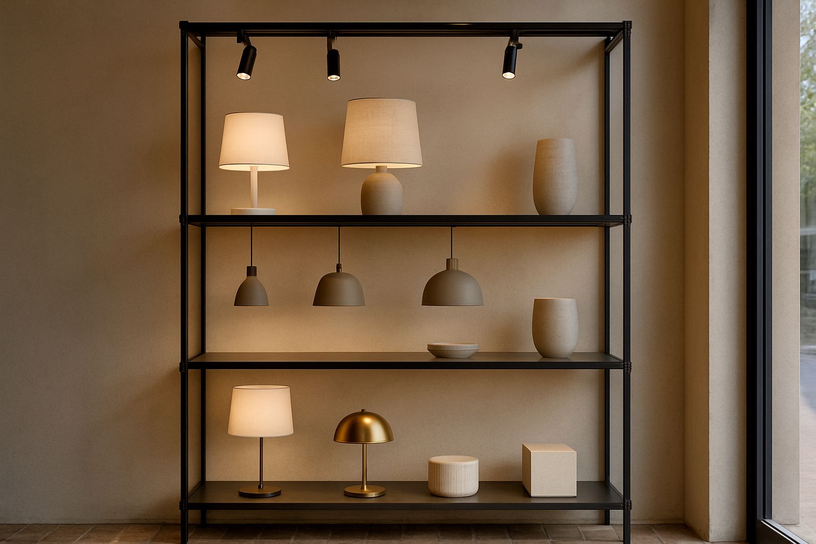
It also helps to compare samples at night, not only in daylight. South African homes and businesses often get strong sun in the afternoon, then switch to artificial light after sunset. A fitting that looks fine at 2pm can feel wrong at 8pm. When possible, check mockups or sample fittings on site before signing off the full installation. That avoids costly changes later.
- Warm timber and fabric: 2700K to 3000K
- Neutral stone, plaster and painted walls: 3000K to 4000K
- Glass, chrome and bright retail displays: 3500K to 5000K
A simple step by step method for choosing
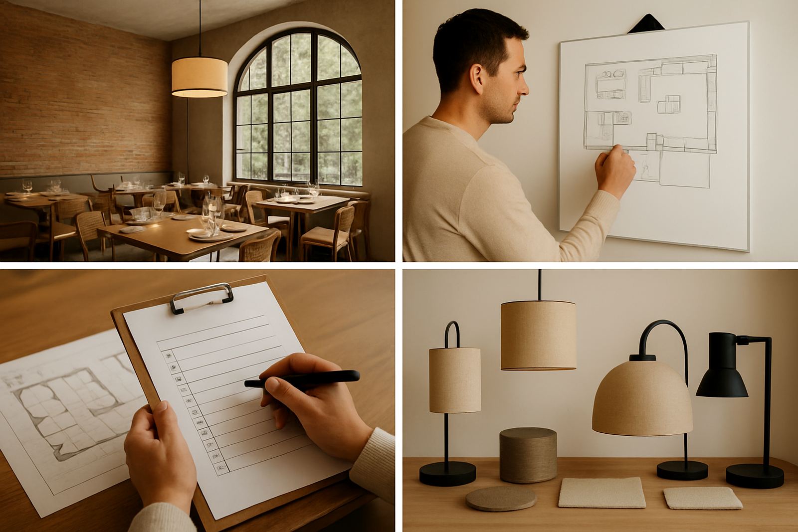
1. List the rooms and what each one must do. A home might have sleeping, reading and entertaining zones. A restaurant may have arrival, dining, bar and kitchen areas. A shopfront may need display, signage and circulation lighting. 2. Decide the mood you want in each zone. 3. Check the colours and finishes already in the space. 4. Decide whether one temperature is enough or whether you need two or three levels. 5. Review the result at night before finalising the install.
If you are planning a project across Rosebank, Pretoria, Midrand or Cape Town, keep maintenance in mind too. A fitting used in a coastal site may need better sealing and easier access for cleaning. If the space depends on lighting during load-shedding, make sure the chosen temperature still looks good when the backup supply is in use, because battery and inverter systems can shift output slightly.
- Define function first
- Match the mood to the room
- Check finishes and sample light on site
- Plan for maintenance and backup power
Common mistakes to avoid
The biggest mistake is choosing a colour temperature from a photo on a phone. Screens distort light, and a single image does not show how it behaves at night or against real materials. Another common error is using very cool light in a home because it seems bright. Bright and comfortable are not the same thing.
In restaurants, light that is too cool can make food look less appetising and the room feel unfinished. In shops, light that is too warm can dull whites and silvers. The other trap is mixing too many temperatures in one open space, which can make the room feel patchy. Keep it intentional. If you use more than one temperature, make sure the transition is clear and justified.
- Do not choose from a screen alone
- Do not use very cool light where comfort matters
- Do not mix temperatures without a clear reason
When to ask for a lighting plan
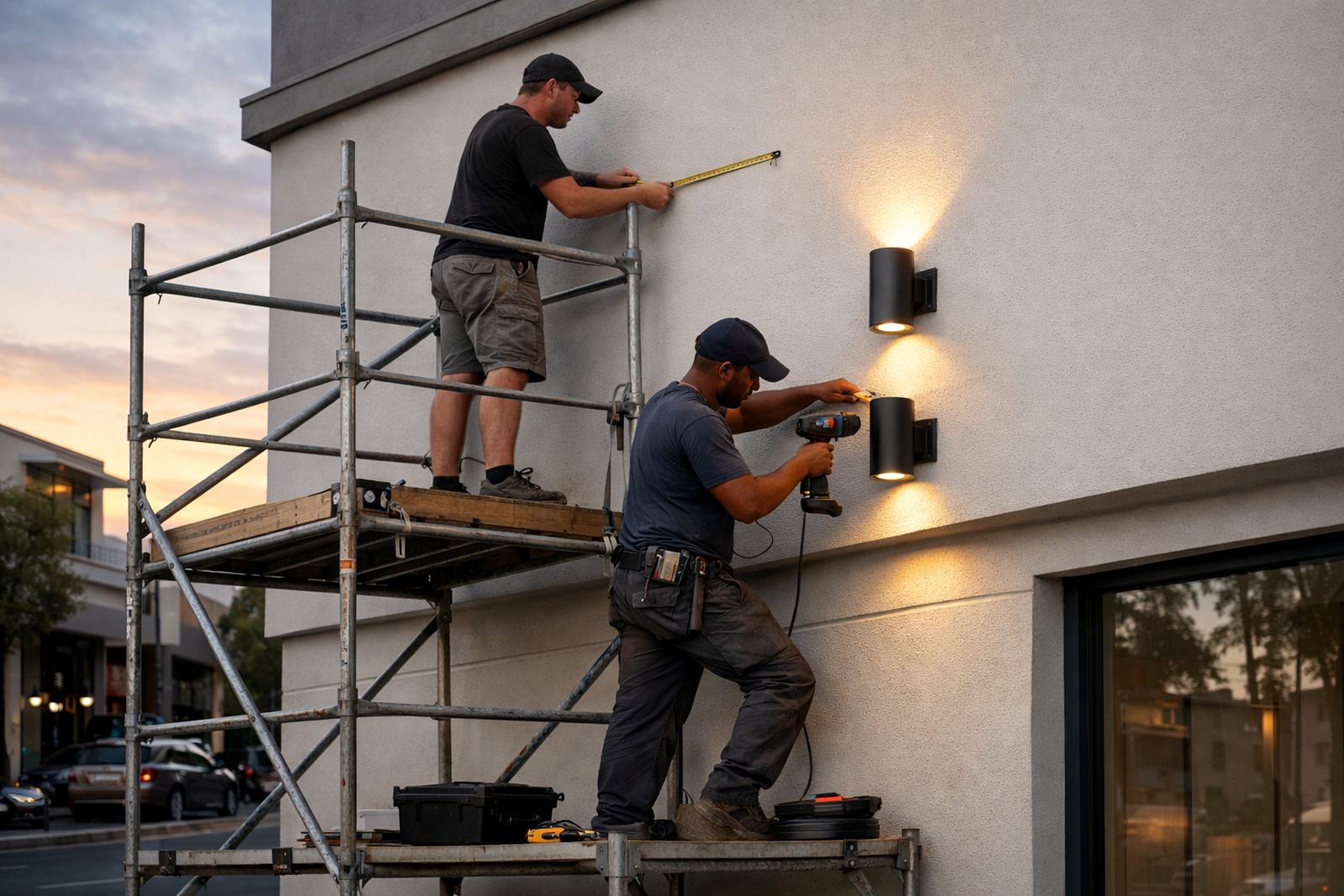
If the space is larger than one room, has several finishes, or needs both atmosphere and task light, a proper lighting plan is worth it. That applies to shopfronts, hospitality venues and full home renovations. A plan helps set the correct colour temperature, beam angles, spacing and control zones before installation starts.
For projects in Johannesburg, Sandton, Pretoria, Durban, Umhlanga and Cape Town, a planned approach also helps with compliance, installation coordination and post install focusing. It saves time on site and helps the finished result feel consistent from one area to the next. If you are unsure, start with a short audit and sample review, then build the rest of the scheme from there.
- Use a plan when more than one room or function is involved
- Use sample fittings before ordering the full set
- Review the final look after installation and focusing