
What colour temperature actually changes in a room
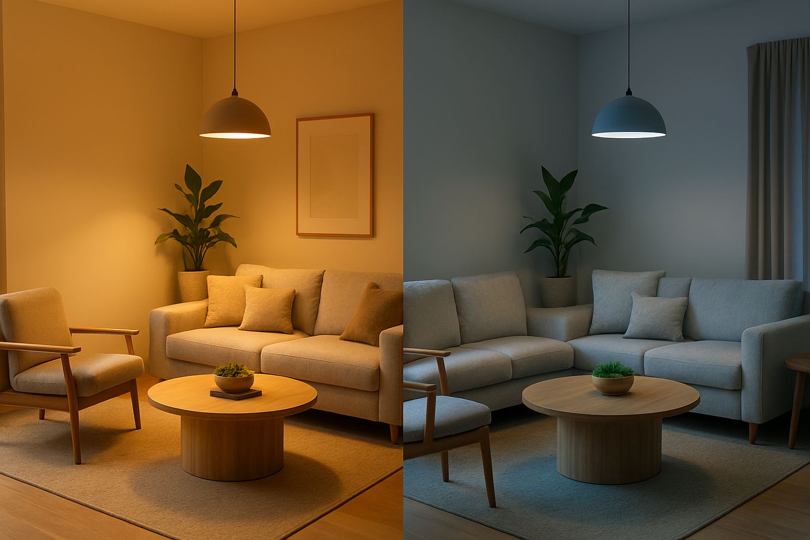
Colour temperature is measured in Kelvin, and it is one of the first things we look at when planning architectural and decorative lighting. Warm light usually sits around 2700K to 3000K and gives off a softer, amber tone. Cool light often starts at 4000K and can go up to 6500K, with a crisper white or bluish feel.
That shift matters because the same room can feel inviting, clinical, bright or calm depending on the light source. In a shopfront, warm light can make timber, leather and fabric look richer. In a kitchen or work area, cooler light can improve visibility and help people see edges, labels and detail more clearly.
For clients in Rosebank, Sandton and Pretoria, we often explain it simply: warm light flatters people and finishes, while cool light supports focus and task work. The best choice is usually not one or the other only, but a balanced mix planned around how the space is used.
When warm light works best in restaurants and homes
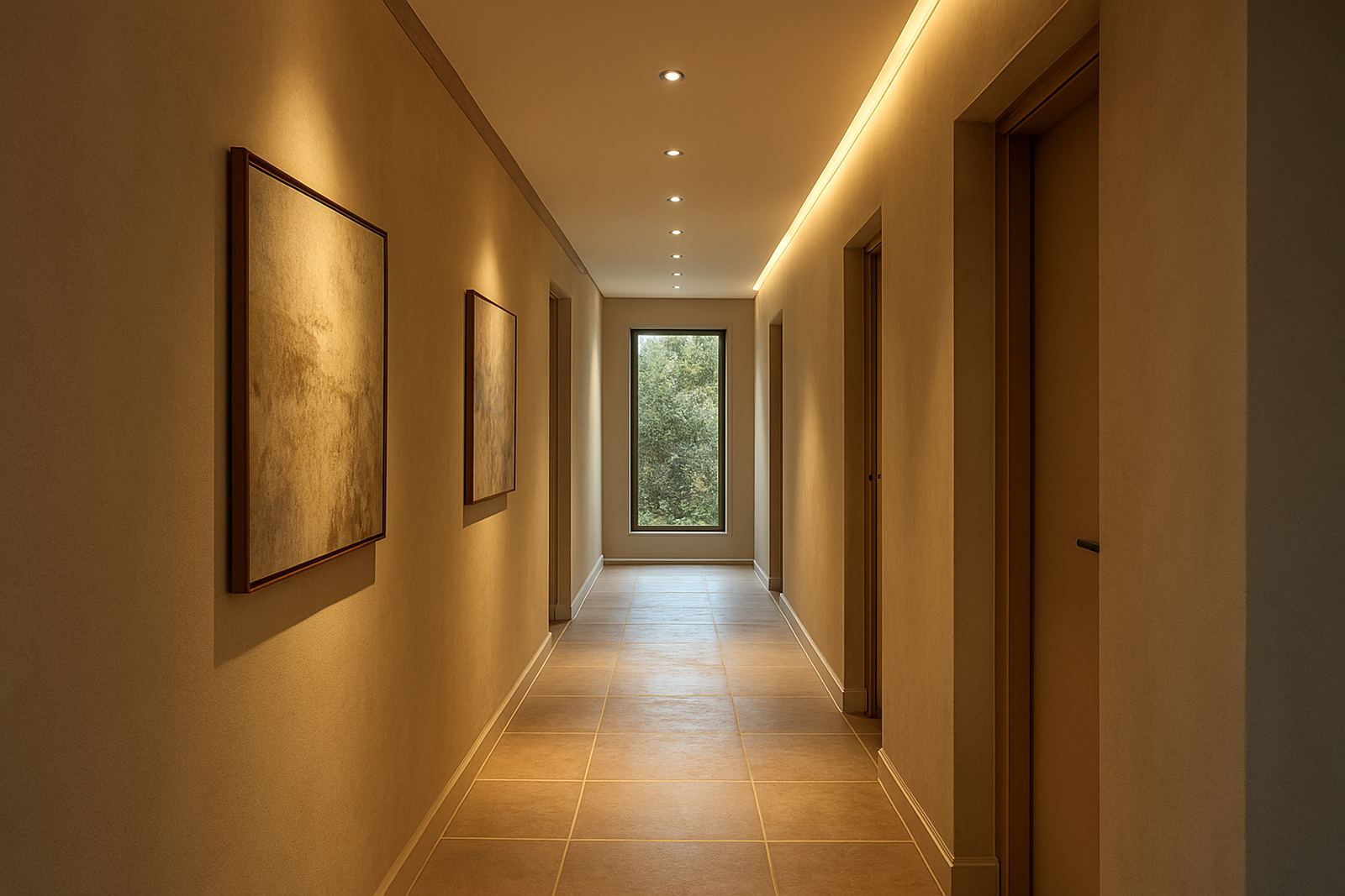
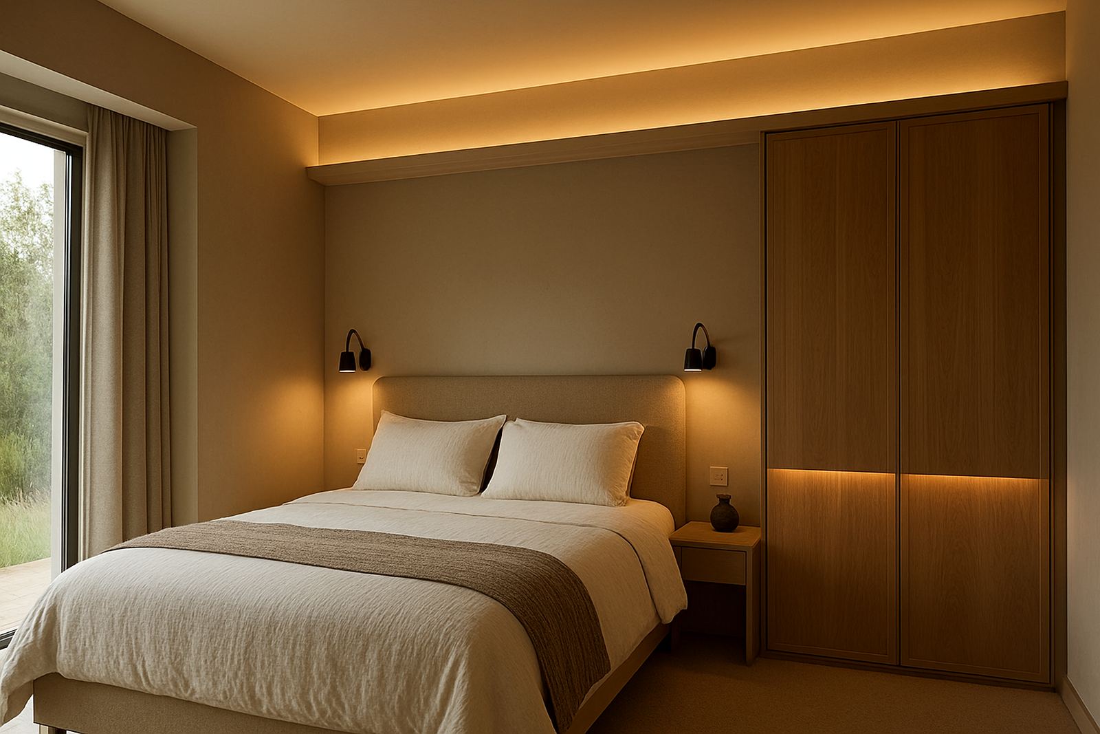
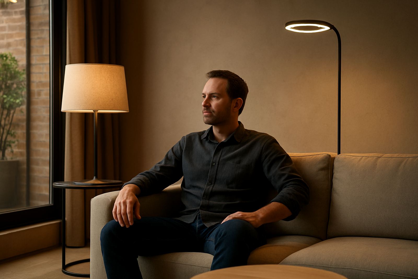
Warm light is usually the better fit for places where people need to slow down and stay a while. Restaurants, lounges, bedrooms and reception areas all benefit from a softer atmosphere, especially in the evening. It helps faces look natural and keeps hard surfaces from feeling cold.
In homes across Johannesburg and Cape Town, we often use warm light in living rooms, dining areas and main bedrooms. It gives a room a relaxed feel and works well with textured finishes, curtains, timber, stone and upholstered furniture. In coastal homes, warm light can also stop interiors from feeling too stark against bright daylight and pale walls.
- Best for dinners, relaxed conversations and hospitality spaces
- Pairs well with timber, brass, fabric and darker finishes
- Helps soften reflective surfaces and strong architectural lines
- Useful where people want comfort rather than high visual alertness
If the light is too warm, though, a room can start to look dim or yellow. That is why we pay attention to lamp output, beam angle and surface colour, not just Kelvin rating on its own.
Where cool light earns its place in retail and task areas
Cool light is useful where clarity matters. Shop counters, fitting rooms, display shelving, prep areas and home studies often need a cleaner, brighter feel. It helps products read accurately, especially whites, greys, cool colours and glossy finishes.
In retail, cool white can make a shopfront feel sharper from the street, which is useful when you need visibility in busy nodes like Sandton, Midrand or Umhlanga. In restaurants, we sometimes use cooler light in back-of-house spaces, servery points and bathrooms where practical visibility matters more than mood.
For homes, cooler light can work in bathrooms, laundries, garages and kitchen worktops. It is also a sensible option where load-shedding has made people more conscious of efficient lighting plans, because a well chosen cooler source can feel brighter without increasing wattage unnecessarily. The trick is to avoid making living areas feel too stark or office-like.
- Best for task areas, product displays and service spaces
- Improves reading of colour, detail and surface defects
- Can make small areas feel cleaner and more open
- Needs careful use in social spaces so it does not feel harsh
How to mix warm and cool light without confusing the space
Most good interiors use both temperatures, but in different layers. You might choose warm ambient light for the main mood, then cooler task light where accuracy is needed. That is common in restaurants with open kitchens, or in homes where a dining room doubles as a homework or work area.
The main rule is consistency within each zone. If the downlights above a table are warm, the decorative pendants or wall lights nearby should not suddenly turn cool unless there is a clear reason. Mixed colour temperatures can make a room feel unsettled and can also affect how finishes are perceived. One fitting can look fine on its own but odd when placed next to another.
Good control design helps here. Dimming, separate switching and properly planned circuits let you shift the mood through the day. A shopfront can run brighter and cooler in trading hours, then soften after hours. A home can feel practical in the morning and more relaxed at night without replacing fittings.
A Johannesburg example: one shopfront, three moods
On a retail project in Rosebank, we dealt with a narrow shopfront facing strong afternoon sun and a busy pedestrian flow. The brief was simple: make the display visible, keep the interior welcoming and avoid a flat, overlit look. We used cooler light on the display wall to keep product colour accurate, then warmer light in the seating and fitting area so the space felt calm when customers stepped inside.
That combination worked because it matched the customer journey. From the street, the front of house read as clear and fresh. Deeper inside, the warmer tones slowed the pace and gave the staff room to talk through the collection. The client also wanted lower running cost and better performance during load-shedding, so the final plan favoured efficient fittings and sensible zoning, rather than throwing light everywhere.
This is a useful lesson for any business in Johannesburg, Pretoria or Durban: the right colour temperature is not chosen in isolation. It is chosen around movement, daylight, finishes and the feeling you want to leave with people after they walk out.
A simple checklist before you choose warm or cool
If you are unsure where to start, look at the space in daylight, then again after sunset. Check what the room is for, what people must see, and how long they spend there. A dining room used for long dinners needs a different feel from a passage used for quick movement.
- What is the main use of the room, social, retail or task based?
- Do you want the space to feel calm, bright, intimate or precise?
- What colours, materials and finishes are already in place?
- Will the space need dimming or separate switching zones?
- Is there strong natural light during the day or very little?
There is no single correct answer. A warm light that flatters a restaurant can be the wrong choice for a product shelf, while a cool light that helps a bathroom function can feel cold in a lounge. The best result comes from matching the temperature to the room’s purpose, not following one rule across the whole property. If you get that balance right, the lighting feels natural and practical, not forced.