
Why dark finishes need more than a single ceiling light
Dark materials absorb light instead of bouncing it back, so the space can look underlit even when the fittings are switched on. That is why a black shopfront, smoked timber wall, or dark painted dining room needs layers of light, not just one bright fitting in the middle of the room.
In practical terms, the job is to create contrast. Light must strike the surface from an angle so the grain, texture, and edges are visible. If every fitting is aimed straight down, the room may meet the minimum brightness, yet still feel flat and gloomy. In homes and hospitality spaces across Johannesburg and Cape Town, this is often the difference between moody and unwelcoming.
Set the contrast before you choose the fittings
Before fixtures are specified, it helps to look at the room as a mix of dark and light planes. A charcoal wall beside a pale ceiling behaves very differently to a full dark shell. The same is true for a restaurant with dark banquettes and a light floor, or a retail frontage with black aluminium frames and reflective glass.
A lighting plan should answer three questions:
- What must be seen first, such as a product display, menu board, or reception point?
- Which dark surfaces should stay soft and atmospheric, and which should read clearly?
- Where does glare matter most, especially at eye level in shopfronts and restaurants?
Once those priorities are clear, the lighting can do its job without forcing every surface to look the same.
Practical layers that keep dark rooms feeling alive
The best result usually comes from three layers working together. Ambient light sets the base level, accent light brings out the features, and task light supports the area where people actually work, eat, or browse. In darker interiors, that third layer is often overlooked, yet it is what stops a counter or passage from feeling dim.
Directional downlights, wall washers, shelf lighting, and concealed linear fittings all have a place. A well placed wall washer can make a deep olive or charcoal wall look rich instead of flat. Small accent beams can pick out artwork, shelving, or a textured finish without lighting the whole room like a waiting area. In homes, this approach works well in lounges and stairwells, and in shops it helps products stand forward from the background.
- Use warmer light for timber and hospitality spaces where comfort matters.
- Use tighter beams for feature zones so the focus stays where you want it.
- Use wider spread light where people move through the space, such as passages and circulation areas.
- Allow for dimming, because dark finishes often need a different level in daylight than after sunset.
Controlling glare on glossy, matt and mixed surfaces
Not all dark finishes behave the same. A matt charcoal wall can hide light spill, while a satin black cabinet may reflect a fitting straight back into the eye. Polished stone, mirrored features and glass panels also change the way the room feels after dark. This is where control design matters as much as the fitting itself.
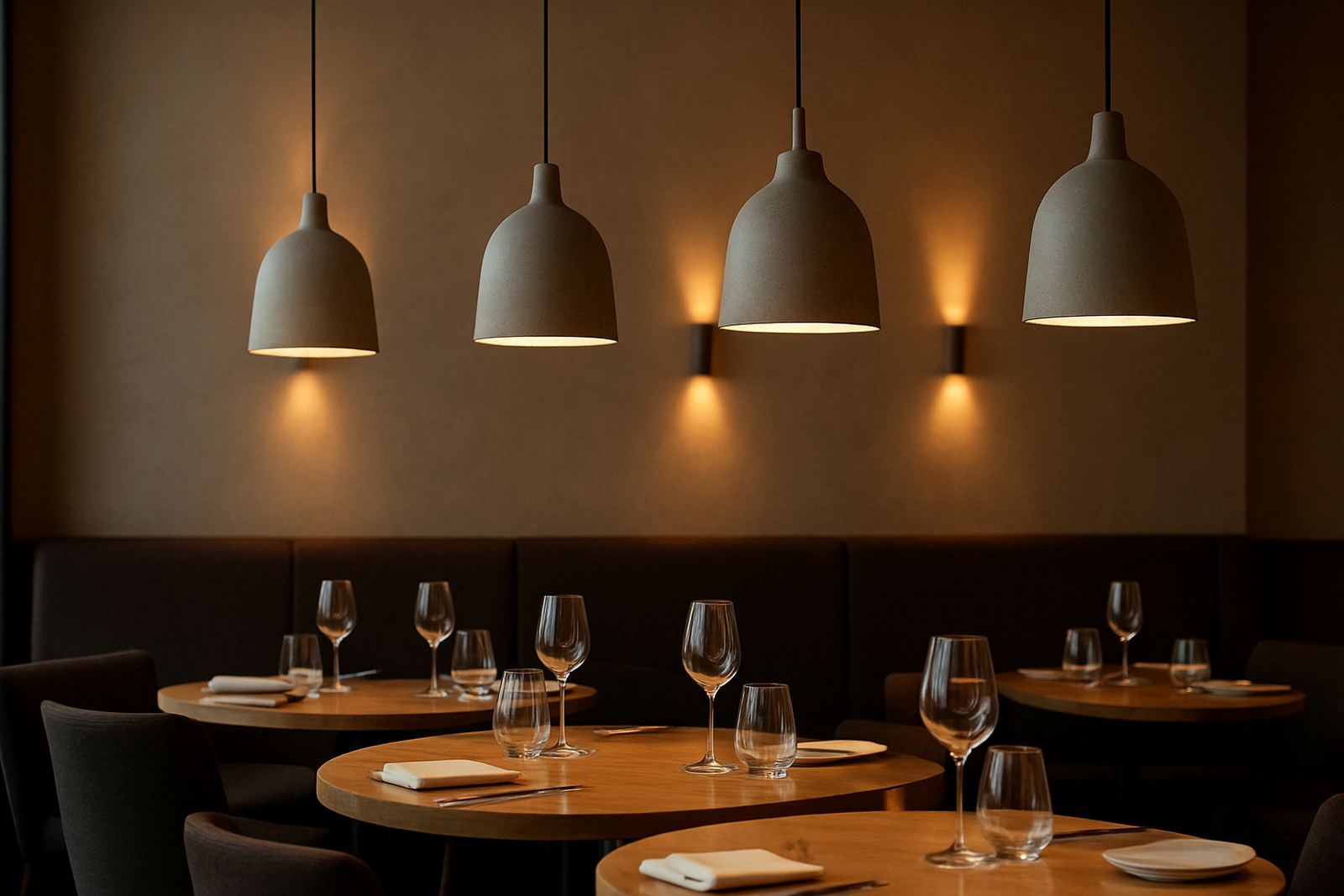
Good aiming, proper shielding, and thoughtful mounting heights all help. In a restaurant, a warm pendant may be beautiful over a table but harsh if it lands in a guest’s line of sight. In a shopfront, a badly placed uplight can create glare on the glass and hide the merchandise behind reflection. Small adjustments make a big difference, and they often cost less than changing the whole scheme later.
For coastal areas like Umhlanga and Durban, humidity and salt air should also be considered when fixture materials and finishes are chosen. In these conditions, exposed components need proper protection and sensible maintenance intervals or they start to look tired quicker than expected.
A Johannesburg example: a dark restaurant that needed warmth, not more wattage
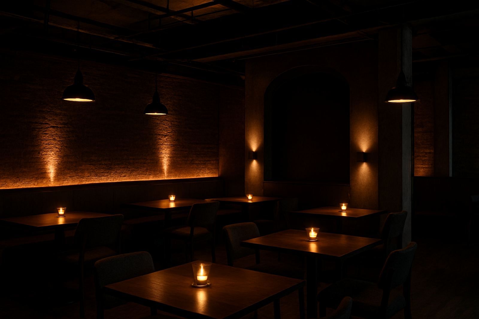
In Rosebank, a restaurant with dark timber wall cladding, black steel details and a deep coloured ceiling wanted atmosphere without losing clarity at the tables. The first instinct was to add brighter fittings, but that would have increased glare and made the room feel harsher. Instead, the lighting was reworked around contrast.
Low-glare downlights gave the dining zones a steady base level, narrow beams picked out artwork and the bar front, and concealed linear light lifted the edges of the banquettes. The result was a room that still felt intimate, but the finishes were now visible in a way that made them look intentional rather than heavy. The staff also found service easier because menus and tabletops were better lit, even during load shedding when backup power had to be used carefully.
How dark finishes change the brief for shops and homes
Retail and residential projects ask for different balances. A shopfront in Sandton may need the dark finish to support the brand while still drawing customers inside. A home in Pretoria may want the same finish to feel calm in the evening and manageable during daylight. Both need light placement that supports the material, not fights it.
For shopfronts, the entrance should read clearly from the pavement and the display zones should carry the strongest accents. For homes, the goal is often softer, with light used to reveal texture, guide movement and keep corners from disappearing. In both cases, it is worth checking the plan at night, not just in daytime. A scheme that looks balanced at noon can feel completely different after 6pm when the dark surfaces start to dominate.
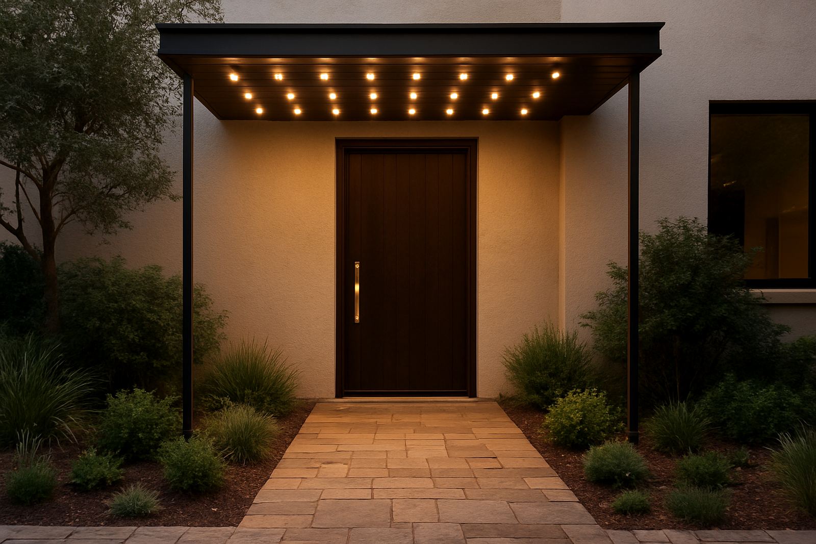
- At entrances, light the frame and threshold so the doorway does not disappear.
- In display areas, mix vertical and horizontal light for depth.
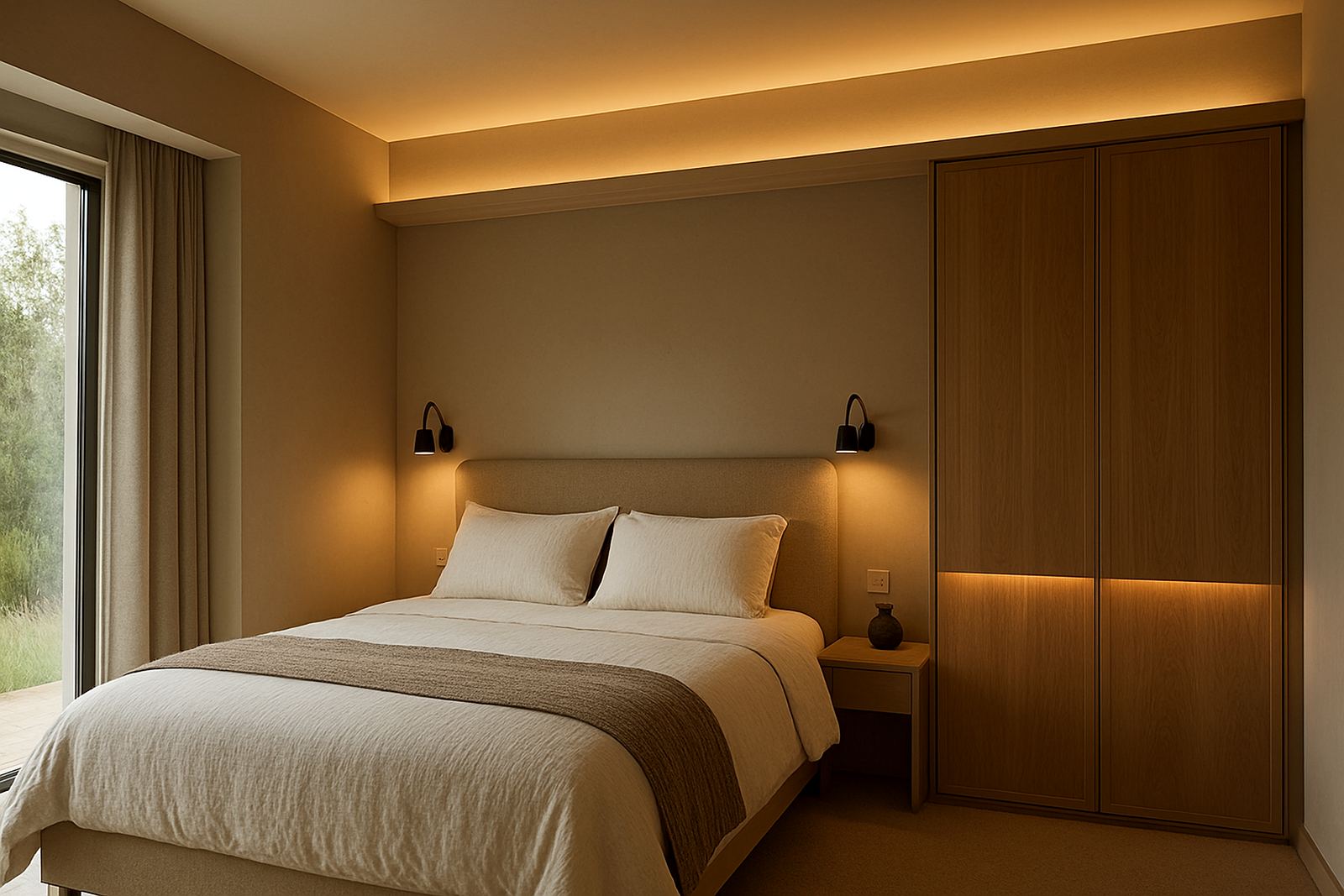
- In living areas, add separate control for scenes such as hosting, reading and evening wind-down.
- In passages or stairways, keep light levels even so dark finishes do not create visual gaps.
What a considered lighting plan actually delivers
When dark finishes are lit properly, the space feels more expensive without needing more ornament. The grain shows, the paint has depth, and the room holds its shape after sunset. That is the real value of planning the lighting around the material, rather than treating the fittings as the last decision.
For projects across Johannesburg, Pretoria, Cape Town, Durban and Umhlanga, this usually means a mix of concept design, fixture specification, layout planning, control design and careful post-install focusing. It is the final aiming and adjustment that often turns a good result into one that feels right day after day. With the correct contrast, dark finishes stay elegant instead of gloomy and the whole space works harder for the people in it.
Choosing the right finish, then lighting it properly
Dark materials are worth keeping, because they can make a room feel grounded and calm. But they need lighting that respects their depth. If you want the room to feel deliberate rather than underlit, start with the surfaces, map the key sightlines, and build the light around those choices.
That approach saves time later, and it also gives you more control over how the space will feel when the sun drops, the streets get busy, and the lights have to do real work.