
Start with the artwork, not the fitting
Good lighting for artwork begins with the piece itself. A textured painting, a photograph under glass and a framed textile all need different treatment, because each one reacts differently to brightness, reflection and colour. In homes and hospitality spaces across Johannesburg and Cape Town, the most common mistake is choosing a light first and then trying to force it to suit the wall.
Measure the artwork and note its position. A small print above a console may only need a narrow beam, while a large canvas in a double-volume room often needs a wider spread or two light points. The aim is to reveal the work clearly while keeping the room calm, not washed out.
- Check the size of the artwork in metres before selecting beam width.
- Take note of glass, varnish or metallic finishes that may reflect light.
- Confirm whether the artwork will be viewed mostly in daylight or after dark.
Use the right level of brightness and colour
Artwork does not need to be blasted with light to stand out. In many cases, a modest level of illumination looks better and feels more expensive. For homes in Rosebank or apartments in Umhlanga, warm white light around 2700K to 3000K often suits paintings and framed prints because it keeps skin tones and earth colours looking natural. Cooler light can work for some contemporary pieces, but it can make warm artwork look flat.
Brightness matters too. Too much light causes glare and can fade sensitive materials over time, especially where the sun is already strong during the day. A good design balances the brightness of the artwork with the rest of the room so the wall is featured, not isolated. In a dining room or restaurant, that balance is especially important because guests need comfort as well as focus.
- Choose dimmable fittings where possible so the light can change with the time of day.
- Keep the artwork slightly brighter than the surrounding wall, not dramatically brighter.
- Match colour temperature to the mood of the room and the medium of the art.
Stop glare before it starts
Glare is one of the main reasons artwork lighting feels wrong. It happens when the beam hits glass at the wrong angle, or when a fitting is placed too close to the viewing line. In a shopfront on Jan Smuts Avenue or a home passage in Pretoria, the fix is usually not more light, but a better angle and more careful placement.
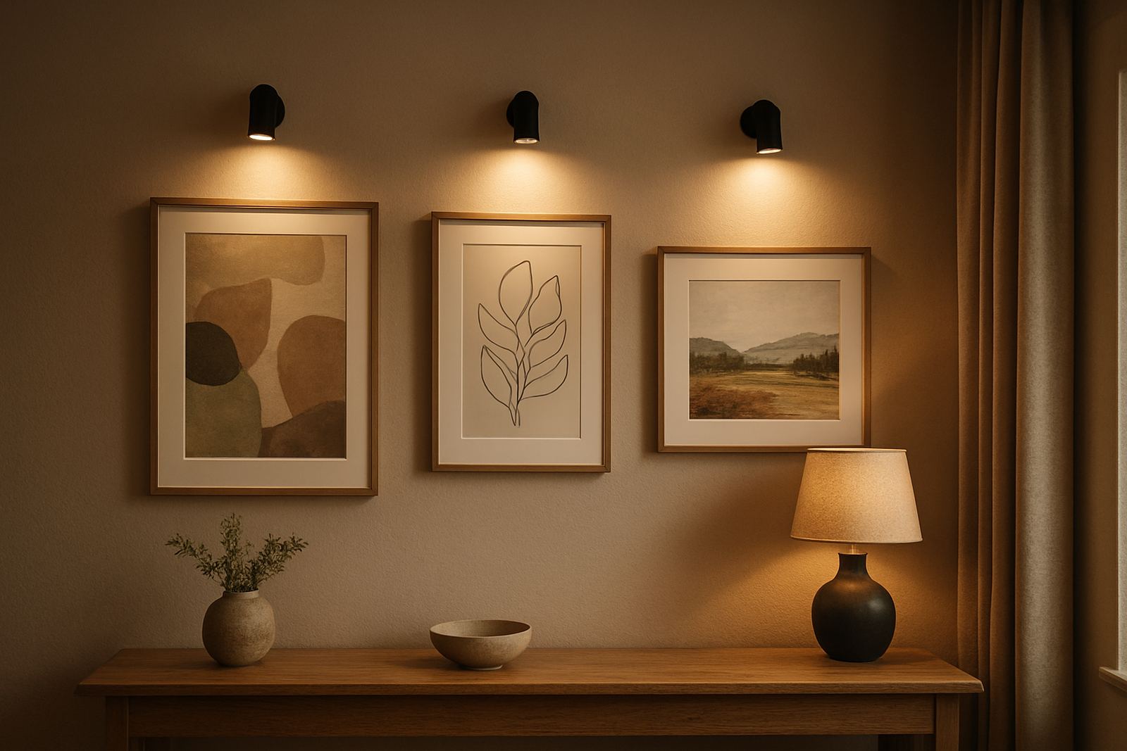
Wall washers, adjustable spotlights and picture lights all have their place. A picture light works well on many framed works, while adjustable ceiling fittings can suit changing displays. For glass framed pieces, the angle is critical. If the viewer sees a bright reflection before the artwork, the design has failed. Site checks matter here because ceiling height, wall depth and furniture layout all affect the result. Minor adjustments on site can make a big difference, even if the plan looked perfect on paper.
- Keep fittings angled to avoid a direct reflection in glass.
- Test the view from standing and seated positions.
- Allow for shadows from cornices, shelves and nearby décor.
Choose fittings that suit the room as well as the frame
Artwork lighting should look like it belongs in the space. In a restaurant, the fittings must support the interior style and not compete with the meal experience. In a home, the light should feel considered and discreet. The finish of the fitting, its size and how it mounts to the wall or ceiling all shape the final look.
Homes in coastal areas like Durban and Umhlanga also need practical thinking. Humidity can affect certain materials over time, so fittings and fixings should be suitable for the environment. In load-shedding prone areas, clients often ask for artwork lighting that can be tied into backup power circuits, which helps keep the room usable during an outage. It is worth planning that early rather than treating it as an afterthought.
- Use fittings that suit the scale of the artwork and the room height.
- Confirm that materials are appropriate for humid or coastal conditions.
- Plan for backup power where artwork must stay lit during outages.
Think about the room after dark, not only the wall
Lighting a painting is not just about the frame. It affects the whole room. If the artwork is the brightest thing in the space, the rest of the room can feel too dark. If the room lighting is too strong, the art disappears into the general wash. The best results come when feature lighting and general lighting work together.
For a living room, that might mean soft downlights with a focused beam over the artwork. For a gallery-style corridor, it could be a series of evenly spaced spots with a consistent spacing pattern. In a restaurant, the artwork may need to hold its own without distracting from tables, menus and conversation. The trick is to light the wall cleanly, while keeping the rest of the ambience under control, no one wants a hard bright patch over the sofa.
A Rosebank example: one wall, three uses
In a Rosebank home, a client wanted to light a large framed print in a lounge that also served as a reading area and occasional entertaining space. The wall was painted a deep neutral tone, and the artwork had a slightly reflective surface. We started with a site lighting audit, then adjusted the beam angle to avoid glare from the opposite window and selected a dimmable fitting with a warm white output.
The final setup allowed the artwork to read clearly at night without turning the wall into a spotlight zone. During load-shedding, the circuit was arranged to work with backup power for a limited period, so the room stayed usable. That kind of practical planning matters just as much as the visual result. The client got a space that felt calm, and the art could finally be seen properly from both the sofa and the dining side of the room.
- Test the view from every main seating position before sign-off.
- Check how the artwork looks with daylight, evening light and backup power.
- Allow enough time for post-install focusing so the final angle is right.
Why careful coordination matters on site
Artwork lighting often looks simple, but the final result depends on good coordination. Fixture specification, layout plans, installation timing and post-install focusing all need to line up. That is especially true in mixed-use spaces like shopfronts and restaurants where wall finishes, signage and display items compete for attention.
At Illumin8d, our team in Rosebank works on concept design, site lighting audits, fixture specification, layout plans, control design, mockups and samples, installation coordination and post install focusing. For artwork in homes and commercial spaces across Johannesburg, Pretoria, Cape Town, Durban and Umhlanga, the goal is the same: make the piece visible, preserve the mood of the room, and keep the solution practical for daily use.