
Why material choice changes the whole lighting plan
Good lighting is never only about brightness. A wall clad in timber will take on a warmer tone, brushed metal can throw back sharp reflections, and polished stone may show every hotspot if the fittings are placed badly. In practice, that means the same downlight or wall washer can look polished in one room and harsh in the next.
For projects in Johannesburg, Pretoria, Cape Town, Durban and Umhlanga, we always start with the material palette before settling on fixtures. Coastal humidity can affect some finishes over time, while a dry Highveld home often needs a different balance of warmth and contrast. The aim is to let the material do its job instead of fighting it. A well set lighting scheme should make timber feel richer, stone feel more grounded, and glass feel clear without exposing every fitting in the ceiling.
Timber needs warmth, not glare
Timber is usually at its best when the light is soft and controlled. Straight downlight onto a timber ceiling or timber slatted wall can flatten the grain and create bright spots, especially if the lamp is too cool. A warmer colour temperature, with careful spacing, helps the wood keep its depth and natural movement.
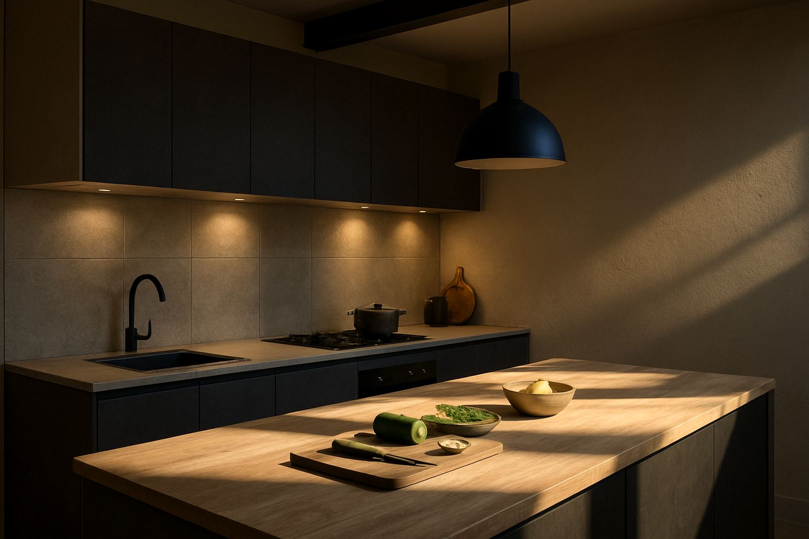
For homes and hospitality spaces, timber often works well with grazing light from a concealed source or narrow wall washers placed to skim across the surface. That brings out the texture without making the room feel overlit. In a Rosebank restaurant, for example, timber panelling near the bar may need a gentle wash so the finish reads well in photographs too, while still feeling comfortable for diners.
- Use warm white light for most timber finishes, especially where the grain should be visible.
- Keep fittings back from the surface where possible to avoid hard shadows and shine spots.
- Test the finish at night, not only in daylight, because timber can shift a lot under artificial light.
Metal finishes depend on beam angle and control
Metal brings a different challenge. Brushed aluminium, powder-coated steel and darker architectural metal all behave differently. Some finishes absorb light, while others bounce it around the room and can create unwanted glare on counters, mirrors or display shelves.
For shopfronts and reception areas, this is where fixture specification and control design matter. A narrow beam can pick out a sign detail or feature strip, while a wider spread may be better for general illumination. If the metal is highly reflective, placing the fitting slightly off axis can help reduce shine. This is especially important in smaller spaces where a few poorly placed lights can make the room feel busy and uneven.
- Choose fittings with good glare control when the room has polished or reflective metal.
- Match the beam spread to the surface size, not just the room size.
- Check reflections from several angles, including seated eye level and the street facing side of a shopfront.
Glass asks for restraint and careful layering
Glass is often the most unforgiving material in a lighting scheme. Clear glass shows reflections, frosted glass can glow beautifully, and textured glass may need a softer approach so the pattern is still readable. If the fittings are too bright or too close, the glass can end up showing the source instead of the detail.
In restaurants and homes, glass is usually best handled with layered lighting. That might mean a quieter ambient level, then focused accents on the table, shelf or artwork behind the glass. For retail, glass shelving and display cabinets often need low-glare fitting positions so the product is visible without the customer seeing their own reflection first. Good placement matters as much as the fixture itself, and sometimes less is more.
Stone benefits from contrast and stronger texture
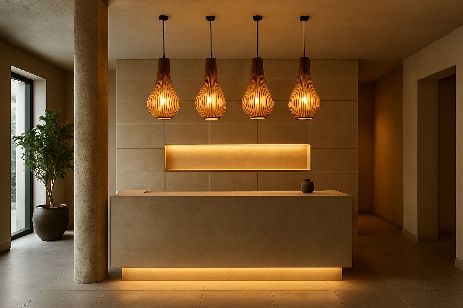
Stone can carry more dramatic lighting than timber or glass. Whether it is a feature wall, floor slab, counter face or exterior cladding, stone usually comes alive when light and shadow are allowed to work together. A flat wash can make a beautiful surface look dull, while a grazing effect can reveal the veining, pitting or chiselled edge that makes the material worthwhile in the first place.
That said, stone also needs balance. Very pale stone near a bright street frontage may reflect too much, and darker stone in a restaurant can disappear if there is no modelling light. In Johannesburg homes and shopfronts, this often means using a combination of ambient light and accent light so the stone remains visible without becoming a hard, cold feature. Testing at sample stage is worth the time, because one fitting position can change the whole feel of the wall.
A local example: Rosebank to Umhlanga, one idea can still suit many spaces
A practical example comes from a mixed brief we often see across Rosebank, Sandton and Umhlanga. A client may want timber ceiling details, a metal feature frame, glass shelving and a stone counter, all in one space. Each material needs a different response, but the final result must still feel unified. That is where concept design, mockups and post install focusing become important.
For a restaurant in Durban or a home in Pretoria, the same principle applies. The timber should feel warm, the metal should not sparkle in your eyes, the glass should read cleanly, and the stone should hold its depth after dark. When the lighting plan respects the materials, the room feels considered and practical at the same time, not overdone.
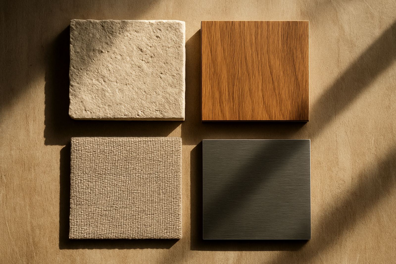
- Start with samples in the actual space, not under office lighting.
- Allow for dimming where the room changes from daytime to evening use.
- Plan for load-shedding and emergency lighting so the material finishes still look good when power drops.
What to check before final installation
Before final fitting, it helps to walk the site and check how the materials look in natural light, evening light and after the control settings are adjusted. A well planned lighting audit can save a lot of rework. Pay attention to ceiling height, reflected glare from windows, and how the finishes behave near open entrances, especially in coastal areas where humidity and salt air can influence the long-term appearance of fixtures and trims.
For shopfronts, restaurants and homes across South Africa, the most useful question is simple: what should this material feel like after dark? If the answer is calm, textured, welcoming or crisp, the lighting plan is probably heading in the right direction. If the material looks flat or too shiny, it usually means the fittings need to be repositioned, dimmed or specified differently.